Thursday, March 25, 2010

Home

Video Walk-Through - Creating A Compensation Structure - Part 1

I've added a video walk-through for Part 1 of the Creating A Compensation Structure series.

From this point forward I'll post the video at the same time as the screen-shot walk-through.

Here's the video for easy reference. It's also part of the original post now.

Video Walk-through


View Larger

Labels: , , , , , , ,

Home

New Gadgets

I'm a gadget freak as anyone reading this blog already knows. I have two new gadgets to share that I've been using now for a couple of weeks.

The first one is the Blue Snowball Microphone. I've been aware of this microphone for over a year through several podcasters recommending it in their shows.

I'm working on series of video tutorials and I decided I should go ahead and upgrade my sound equipment. This microphone is extremely highly rated on Amazon and my local Apple store carries it.

I can safely say that it is the sturdiest microphone I've handled for a prosumer level of technology. It's very easy to assemble; just screw the base into the top and extend the legs. The software drivers were already installed on my Mac (and should be either already installed or easily installed for Windows). It's a USB microphone, so connecting it to my computer was a breeze. The microphone shows up as another input for audio in my recording applications. I had to adjust the input gain to make sure that it was loud and clear but that was the only adjustment I had to make. It's a beautifully made piece of equipment and works flawlessly.

The second gadget is way more interesting to me, although I'm happy to have a great microphone, it's not something that I'll use everyday. But I do need wireless access to the internet everyday.

Usually I work from home or from my office, both of which have nice fast wireless internet available. The issues arise when I'm out of the office on work or travel. I'm a regular at the local coffee shops with free wifi. That's a nice intermediate solution, it's nice to get out of the office and work in a coffee shop. But what about those times when I need to access my e-mail and I'm waiting at my kids' school to pick them up, or when I'm in traffic (as a passenger) and I need to send a proposal, or maybe I'm on a road trip (again as a passenger) and I want to work on something requiring an internet connection.


The solution has arrived in the form of MiFi. Sprint is hopping on the MiFi bandwagon in a big way. They've been running TV commercials for a while now and they even have one with the iPhone as the centerpiece of the advertisement.

Verizon also has this technology and I'm a big fan of the Verizon network (not just because of their TV commercials either, my neighbor works for them and he raves about the service).

I hadn't really been thinking that this was something I needed until I started looking at the new iPad with WiFi versus the iPad with 3G. The WiFi only model is less expensive, weighs less, and is available weeks before the 3G model. Plus the 3G model requires another 3G contract with AT&T. I have nothing against AT&T. The service has been good for me on my iPhone, but did I really want another contract for my soon to arrive iPad?

It was something I wrestled with for a few days. Then I saw this article about Verizon seeing the iPad as an opportunity to expand it's MiFi services. I was intrigued. I could connect up to 5 devices to the MiFi device and have wireless internet anywhere there's a Verizon 3G signal.

Being a numbers driven person, I created a spreadsheet to analyze the cost of buying the iPad WiFi with a 2 year Verizon contract versus the iPad 3G model using the AT&T 3G contract. I won't go into all the details but it turns out over the course of two years that the iPad + Verizon combo is about $24 a month more than the iPad 3G device.

That clinched it for me as I realized that $24 a month would buy me always on wireless access on not only my soon to arrive iPad but also on my MacBook Pro, my iPhone and two more devices all at the same time.

Here's a quote from Charlie Sorrel of Wired Magazine.

"Until you experience a bubble of Wi-Fi that surrounds you wherever you go, you won’t know how handy it can be."

This is so true. The first time I used the MiFi I felt exhilarated at both the speed of the 3G connection on my MacBook Pro and the fact that I could take it anywhere with me. It felt just like a "bubble of Wi-Fi".

Over the past week I've used the MiFi everyday. And I've started to realize that this is the future of Wi-Fi. We are all going to be walking around with this bubble of Wi-Fi. The MiFi device will shrink to the size of a keyfab and we'll carry it around with us all the time in our pocket with our car keys, always on, always available. That's the future I see coming. And it's almost here...

Monday, March 22, 2010

Home

An evening of spoken words and other non-work items

Last week I attended Word Jazz at Boxley's in North Bend. Boxley's is a new restraurant / jazz club in North Bend. NEXTCOMP.NET was a sponsor for the event. I wanted to support writing and literature in the Snoqualmie Valley, especially when it involves an evening out with family and friends!

SnoValleyWrites! Word Jazz

Several members of the local SnoValleyWrites! organization read from works that they had written. Many of the authors are published and the stories were very well written.


We all played a game similar to MadLibs where we filled in words on the colored sticky notes and the evening's MC's put them together into a funny story.

In addition to sponsoring the event, I also submitted a story for the community writing challenge. The prompt was "A reporter shows up at your door and starts asking strange questions about your neighbor." I've been working editing my NaNoWriMo story which is a ghost story, so my mind immediately went to something slightly scary and spooky. You can read the story here, shared through Google Docs new File Share feature. I didn't win, which was totally fine, because the winning stories were very good. My favorite of the evening was written by an 11 year old. It was fun, well paced, and very enjoyable. She did a great job of reading it aloud in front of a room full of adults (with some kids interspersed in the crowd).


In other community related news, we ate dinner at McDonald's last week to support my daughter's middle school. Every few months teachers from the school work at the counter taking orders and getting the customers revved up to support the school. A portion of the evenings proceeds go to the school. It's always a well attended and lively evening. And my kids love eating at McDonald's, so they don't complain too much about being there either!


If you haven't visited my Flickr stream in awhile, you should check it out, as I've been busy posting there again. Some of my favorites relate to the wildlife here in the Snoqualmie Valley. For instance, check out what my kids and I saw on the way to school the other morning.

Elk Herd In North Bend - Hanging Out

That about wraps up this post. I hope you have a great week. Spring is here (in the northern hemisphere anyway)!

Up next, Part 2 of the how-to design a new compensation structure series.


Labels: , , , , ,

Thursday, March 18, 2010

Home

Building A New Compensation Structure - Part 1

This is the first in a series of articles on the typical steps used in designing a new compensation structure. This is based on my 20+ years of experience in compensation design. I'm going to go through the process step-by-step using plenty of screenshots and videos along the way. Here's an outline for the series of articles. This may change or evolve as I go through the process, but it's a starting point.
  1. Understanding the current or existing structure
  2. Plotting the market data against the current structure
  3. Costing models - Moving all the way to market
  4. Costing models - Alternatives
  5. Finalizing the design
  6. Presenting the process and recommendations
So let's kick this off with Part 1 - Understanding the current or existing structure.

The assumption in this tutorial is that we have an existing pay structure in our organization that hasn't been fully reviewed compared to market in several years. There have been a few spot checks as new hires were brought on board, but we don't know for sure if the entire structure is market competitive.

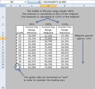
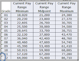
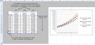
Here's what the current structure looks like in Excel. I've annotated the table to explain a few important details.


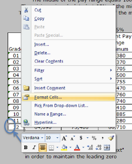
I've formatted the grade column with the "text" format option. The following two screenshots show how to format the cells as "text". This will allow you to enter leading zeros without Excel automatically removing them when you press Enter on the keyboard.

Highlight the cells that you want to format.
Right click over the selected cells.
Choose the "Format Cells..." option.

Choose the Text option from the Category: list.
Click OK

The following areas of the structure are important to understand before we can begin to design a new structure based on the market data.

A. The midpoint growth and the CEILING formula

The current structure is based on the midpoint of Grade 01. In a sense, the Grade 01 midpoint is the lynchpin of the design. By changing this figure the entire structure would be affected. The midpoint of grade 02 is approximately 12% greater than the midpoint of grade 01. Similarly, the midpoint of grade 03 is approximately 12% greater than the midpoint of grade 02.

Why approximately and not exactly 12% greater? Well, I wanted to make the midpoints "pretty" by rounding them to the next higher $100. I used a formula in Excel to accomplish this automatically. The formula is called CEILING.


In effect, the CEILING formula rounds the midpoints up to the next $100. This makes for a cleaner and easier to explain structure.

Communication is something that we need to be aware of as we design the new structure. It has to be clear and explainable to the organization's employees. I've never been a big fan of midpoints that are exact to a dollar, that's a personal opinion, but one that is based on experience. Exact dollar amounts convey a sense that the market data is that precise, when in fact it's not, we can get close but the market data is best expressed in terms of ranges of pay for a job, hence the need for pay ranges in the grade structure.

B. Range width and minimum and maximums

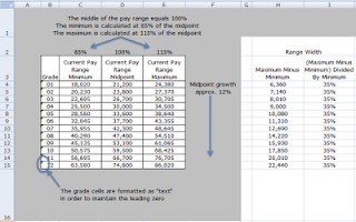
The next important aspect of the current structure is the range width. The width describes the breadth of the range from the minimum to the maximum. It is defined by the minimum dollars as a percentage of the midpoint and by the maximum dollars as a percentage of the midpoint.

The current design has a minimum that is 85% of the midpoint. The maximum is 115% of the midpoint. By default, the midpoint is defined as being 100%. Typically the 100% is tied to the market data in some fashion. The way to understand the structure, and ultimately explain it to employees, is to tie the midpoints to the market data. So when an employee's pay is at the midpoint we can say that the employee is at 100% of the market.

The formula for calculating the width of the range is:

(Range Maximum Minus Range Minimum) Divided By Range Minimum

Typical range widths are from 35% to 65%. The current ranges are 35% in width.


C. Charting the ranges

We'll be using several charts to show how the ranges compare to the market data and the average employee data.

We'll use a "Line with Markers" chart.

The first step is to select the structure in the Excel file, including the column headers and the grades.

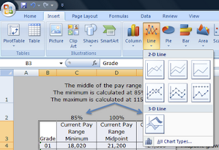
From the Insert ribbon, click on the Line button and then click on the "Line with Markers" chart type.


Excel will place a default chart onto the worksheet.


Next, right click on the chart and click the "Move chart..." menu item. If you don't see the "Move chart..." item, then click away from the chart onto the worksheet to deselect the chart, then click on it again, then right click to display the pop-up menu.

Choose to move the chart to a "New Sheet". You can also name the sheet in this step.


Excel will create a new sheet with the chart as the only object on the sheet.


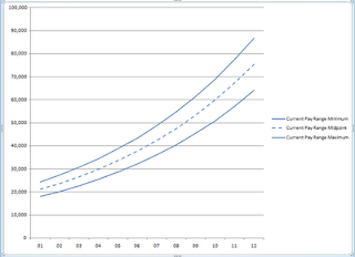
We'll want to change the format of the lines so that each type of data is color coded. We'll be adding market data as well as average employee pay data to the chart in subsequent steps.

Here's how to format the chart lines.

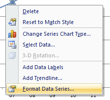
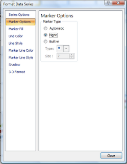
Click on the bottom line, then right click on the same line. A pop-up menu will appear. Click on the Format Data Series... menu item.

From the Marker Options tab, choose None for Market Type.

From the Line Color tab, click on the Color menu item and then choose a blue color. I used the leftmost blue in the top row of colors.

Click close.

Repeat the above steps for the middle line. Only this time, you'll also want to change the Line Style to dashed.


Repeat the steps again for the top line, only don't change the Line Style for the top line.

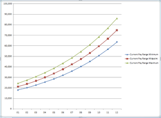
When you're finished you'll end up with a nice clean looking chart similar to the one below.


Video Walk-through


View Larger

Next Steps

What we don't know at this point is whether or not the current midpoints really are at 100% of the market. At some point in the past, when the ranges were originally designed, our assumption is that they were pegged to market.

In the next article I'll discuss adding the market data results to the chart and comparing the market data to the current ranges.


Labels: , , , , , , , , , ,