Building A New Compensation Structure - Part 1
This is the first in a series of articles on the typical steps used in designing a new compensation structure. This is based on my 20+ years of experience in compensation design. I'm going to go through the process step-by-step using plenty of screenshots and videos along the way. Here's an outline for the series of articles. This may change or evolve as I go through the process, but it's a starting point.

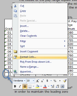
I've formatted the grade column with the "text" format option. The following two screenshots show how to format the cells as "text". This will allow you to enter leading zeros without Excel automatically removing them when you press Enter on the keyboard.
- Understanding the current or existing structure
- Plotting the market data against the current structure
- Costing models - Moving all the way to market
- Costing models - Alternatives
- Finalizing the design
- Presenting the process and recommendations
The assumption in this tutorial is that we have an existing pay structure in our organization that hasn't been fully reviewed compared to market in several years. There have been a few spot checks as new hires were brought on board, but we don't know for sure if the entire structure is market competitive.
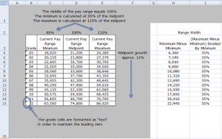
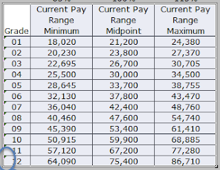
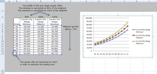
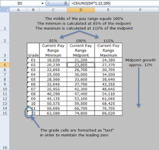
Here's what the current structure looks like in Excel. I've annotated the table to explain a few important details.

I've formatted the grade column with the "text" format option. The following two screenshots show how to format the cells as "text". This will allow you to enter leading zeros without Excel automatically removing them when you press Enter on the keyboard.
Highlight the cells that you want to format.
Right click over the selected cells.
Choose the "Format Cells..." option.
 Excel will place a default chart onto the worksheet.
Next, right click on the chart and click the "Move chart..." menu item. If you don't see the "Move chart..." item, then click away from the chart onto the worksheet to deselect the chart, then click on it again, then right click to display the pop-up menu.
 Choose to move the chart to a "New Sheet". You can also name the sheet in this step.

 Excel will create a new sheet with the chart as the only object on the sheet.
 From the Marker Options tab, choose None for Market Type.
 From the Line Color tab, click on the Color menu item and then choose a blue color. I used the leftmost blue in the top row of colors.
 Click close.
 Repeat the steps again for the top line, only don't change the Line Style for the top line.
View Larger

Choose the Text option from the Category: list.
Click OK


The following areas of the structure are important to understand before we can begin to design a new structure based on the market data.

A. The midpoint growth and the CEILING formula
The current structure is based on the midpoint of Grade 01. In a sense, the Grade 01 midpoint is the lynchpin of the design. By changing this figure the entire structure would be affected. The midpoint of grade 02 is approximately 12% greater than the midpoint of grade 01. Similarly, the midpoint of grade 03 is approximately 12% greater than the midpoint of grade 02.
Why approximately and not exactly 12% greater? Well, I wanted to make the midpoints "pretty" by rounding them to the next higher $100. I used a formula in Excel to accomplish this automatically. The formula is called CEILING.


In effect, the CEILING formula rounds the midpoints up to the next $100. This makes for a cleaner and easier to explain structure.
Communication is something that we need to be aware of as we design the new structure. It has to be clear and explainable to the organization's employees. I've never been a big fan of midpoints that are exact to a dollar, that's a personal opinion, but one that is based on experience. Exact dollar amounts convey a sense that the market data is that precise, when in fact it's not, we can get close but the market data is best expressed in terms of ranges of pay for a job, hence the need for pay ranges in the grade structure.
B. Range width and minimum and maximums
The next important aspect of the current structure is the range width. The width describes the breadth of the range from the minimum to the maximum. It is defined by the minimum dollars as a percentage of the midpoint and by the maximum dollars as a percentage of the midpoint.
The current design has a minimum that is 85% of the midpoint. The maximum is 115% of the midpoint. By default, the midpoint is defined as being 100%. Typically the 100% is tied to the market data in some fashion. The way to understand the structure, and ultimately explain it to employees, is to tie the midpoints to the market data. So when an employee's pay is at the midpoint we can say that the employee is at 100% of the market.
The formula for calculating the width of the range is:
(Range Maximum Minus Range Minimum) Divided By Range Minimum
Typical range widths are from 35% to 65%. The current ranges are 35% in width.

C. Charting the ranges
We'll be using several charts to show how the ranges compare to the market data and the average employee data.
We'll use a "Line with Markers" chart.
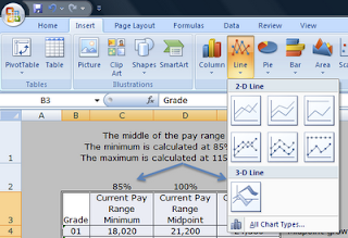
The first step is to select the structure in the Excel file, including the column headers and the grades.

From the Insert ribbon, click on the Line button and then click on the "Line with Markers" chart type.

 Excel will place a default chart onto the worksheet.
Next, right click on the chart and click the "Move chart..." menu item. If you don't see the "Move chart..." item, then click away from the chart onto the worksheet to deselect the chart, then click on it again, then right click to display the pop-up menu.
 Choose to move the chart to a "New Sheet". You can also name the sheet in this step.
 Excel will create a new sheet with the chart as the only object on the sheet.
We'll want to change the format of the lines so that each type of data is color coded. We'll be adding market data as well as average employee pay data to the chart in subsequent steps.
Here's how to format the chart lines.
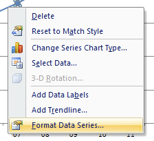
Click on the bottom line, then right click on the same line. A pop-up menu will appear. Click on the Format Data Series... menu item.
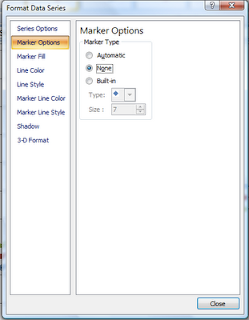
 From the Marker Options tab, choose None for Market Type.
 From the Line Color tab, click on the Color menu item and then choose a blue color. I used the leftmost blue in the top row of colors.
 Click close.
Repeat the above steps for the middle line. Only this time, you'll also want to change the Line Style to dashed.
 Repeat the steps again for the top line, only don't change the Line Style for the top line.
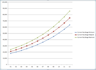
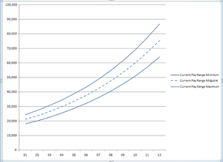
When you're finished you'll end up with a nice clean looking chart similar to the one below.

Video Walk-through
View Larger
Next Steps
What we don't know at this point is whether or not the current midpoints really are at 100% of the market. At some point in the past, when the ranges were originally designed, our assumption is that they were pegged to market.
What we don't know at this point is whether or not the current midpoints really are at 100% of the market. At some point in the past, when the ranges were originally designed, our assumption is that they were pegged to market.
In the next article I'll discuss adding the market data results to the chart and comparing the market data to the current ranges.
Labels: base pay, design, excel, excel tip, formula, formulas, howto, market data, market pricing, pay, structure
posted by Matt Johnson at
8:15 PM
|
0 comments


